
Team MLE's Favorite Fall Design Details
Fall is easily team MLE’s favorite season. The crisp air, changing leaves, and incredible textures have us wishing this time of year would last just a little bit longer. So today, we’re reveling in the beauty of the season and sharing a few of our team member’s favorite fall design details! Take a look for yourself and then head to our Instagram and tell us which is your favorite!
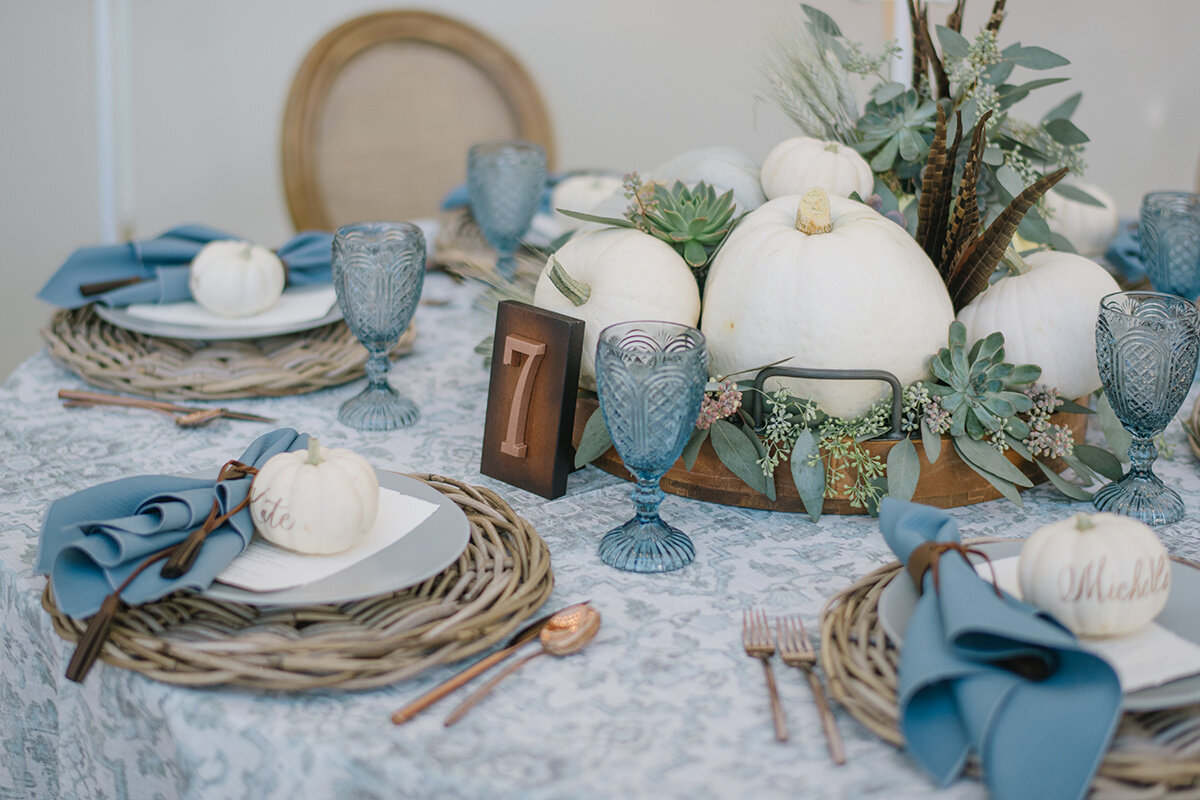
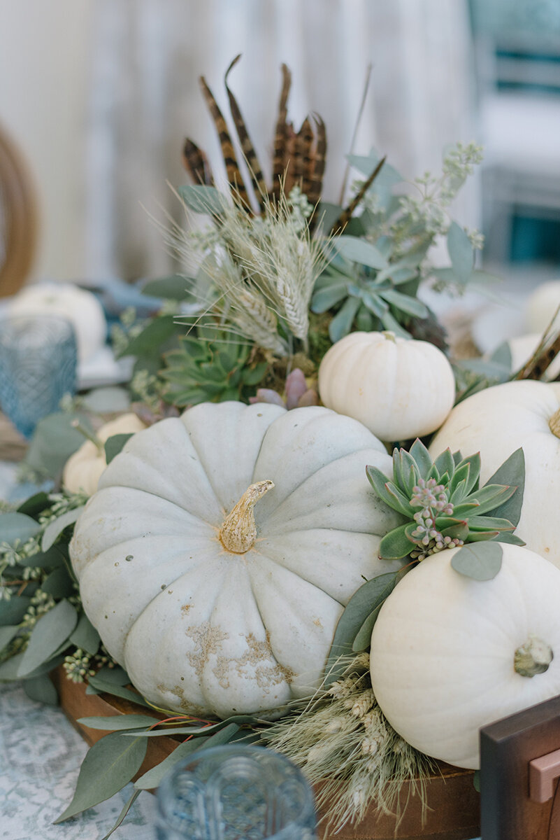
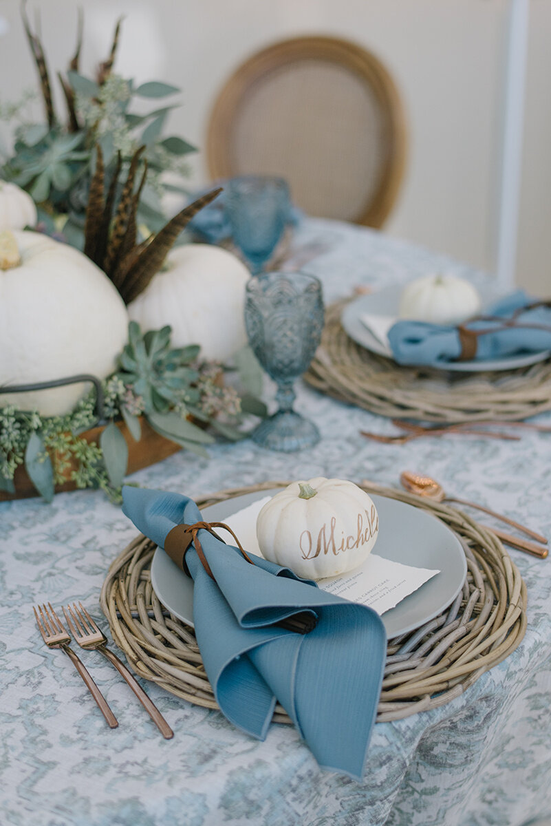
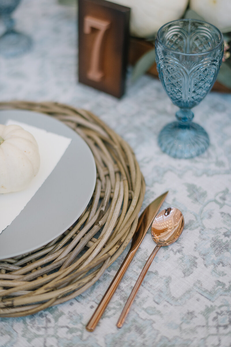
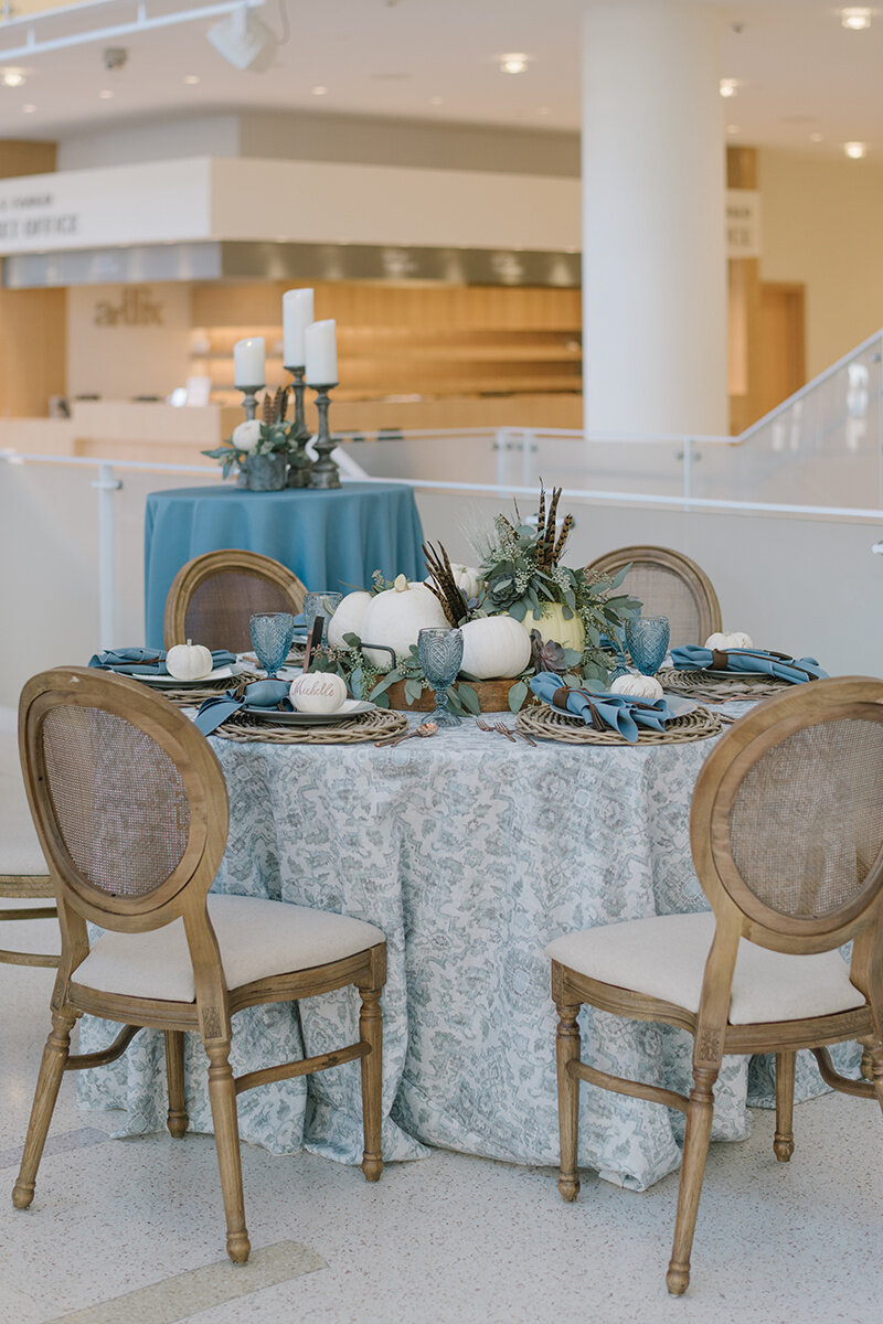
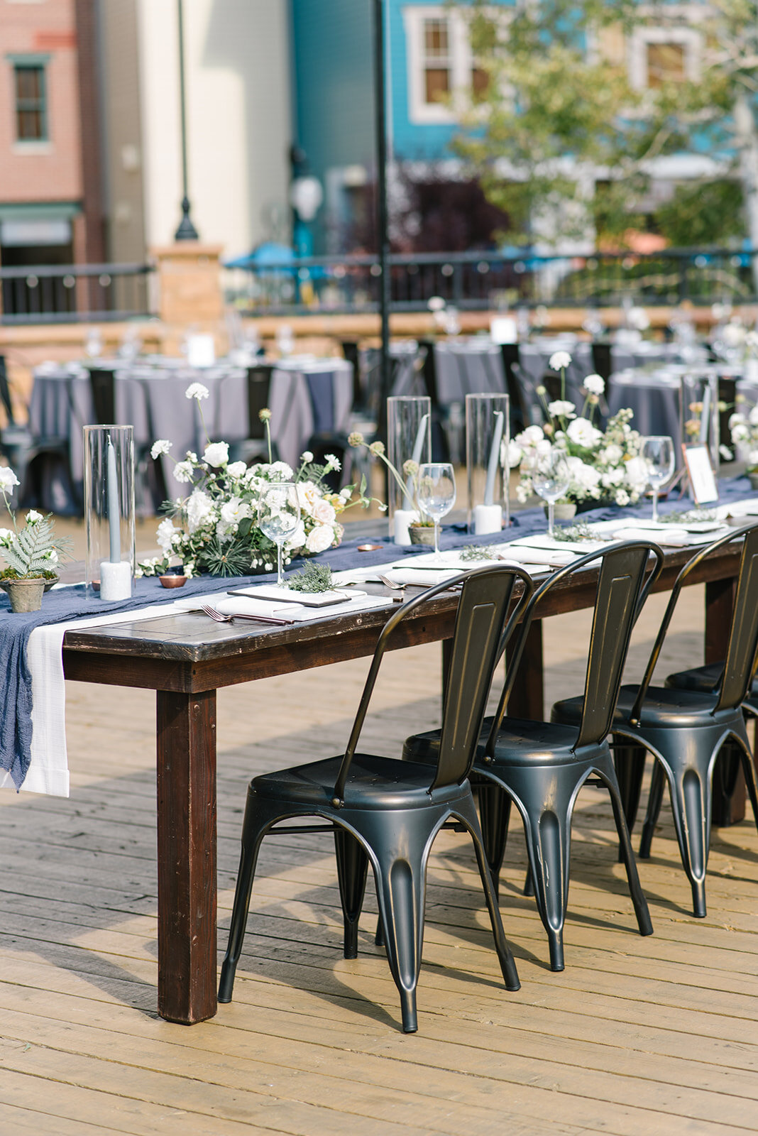
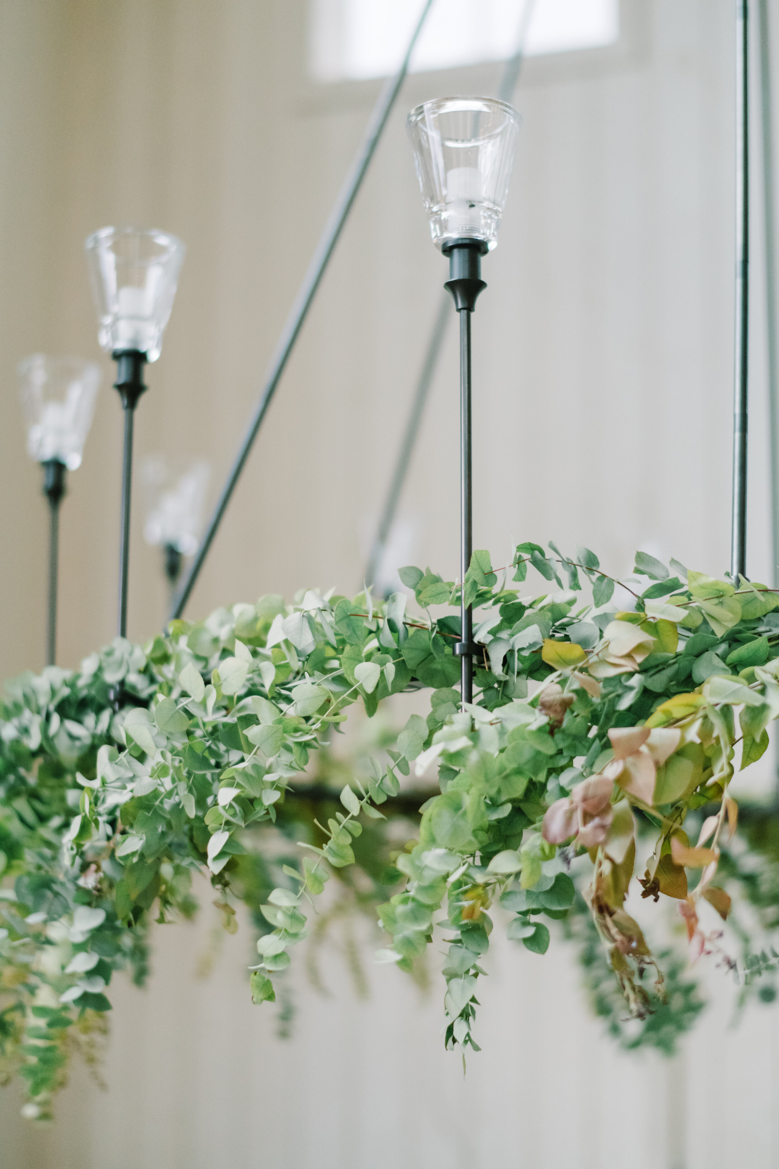
Michelle says “My favorite fall-themed look would be this design created for the critics luncheon. I love how the color palette is unexpected yet so seasonally appropriate! I've always been drawn to the tranquil tones of blues, greens whites and grays, and they work surprising well together when creating this unexpected fall tablescape! For this look, we incorporated pumpkins and gourds in soft, watercolor shades but struck a balance through the use of bolder tones to offset the soft color palette. For example, a wooden tray was utilized as the vessel for the bountiful and texture-heavy centerpiece and I love how the subtle use of pheasant feathers anchored the lighter shades of the pumpkins and seeded eucalyptus. Leather details such as the napkin ring combined with a basket weave chargers provided an earthiness to the design while accents of wood and copper in the flatware and table numbers provided some added warmth to complete this bountiful look.”
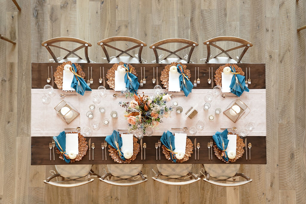
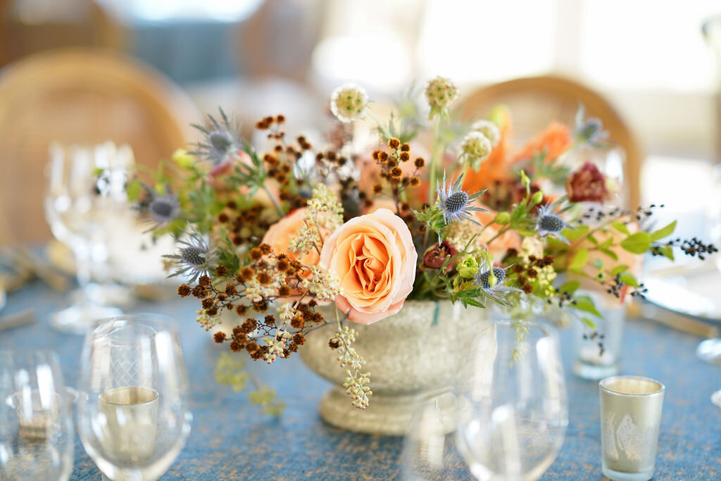
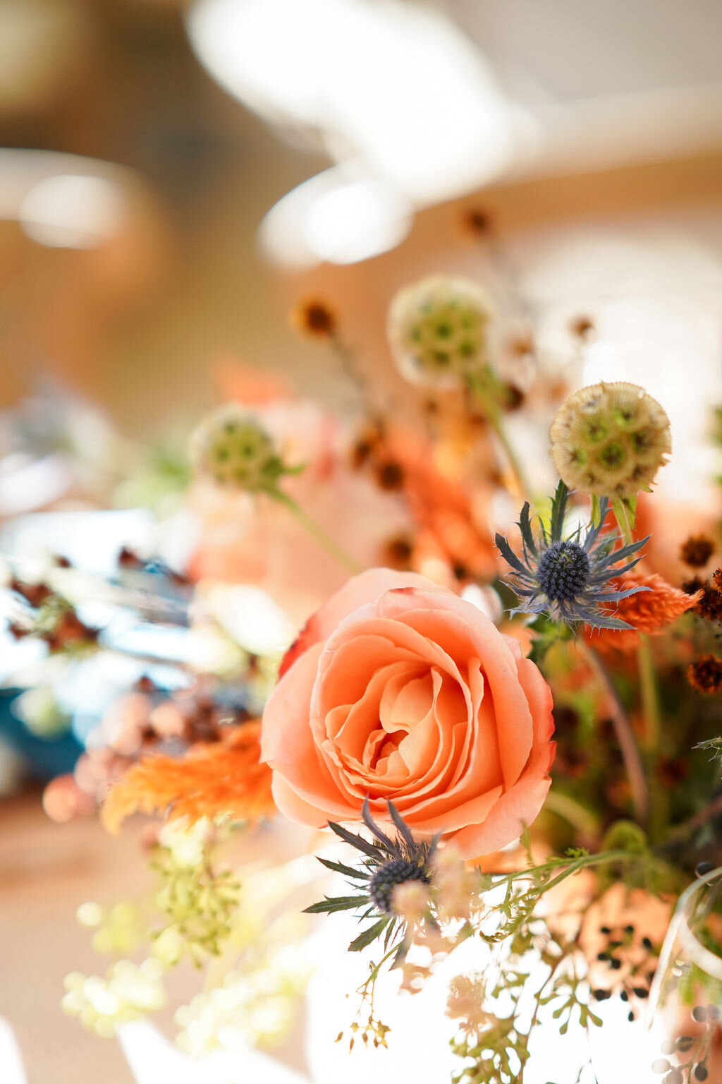
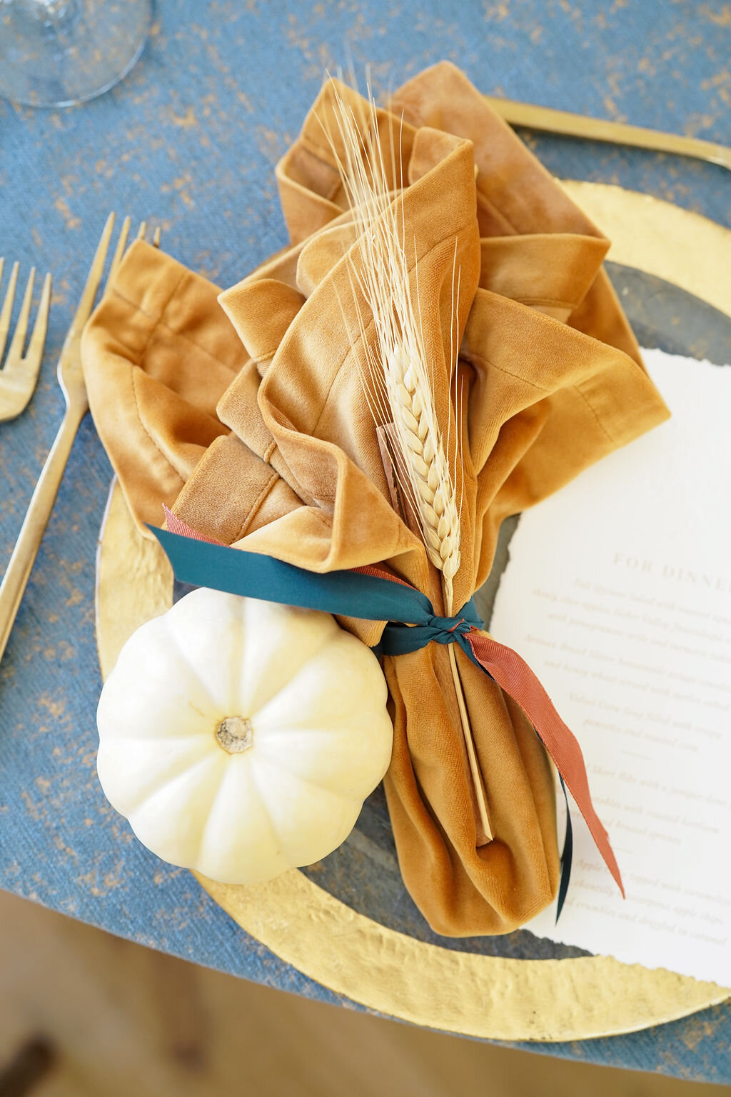
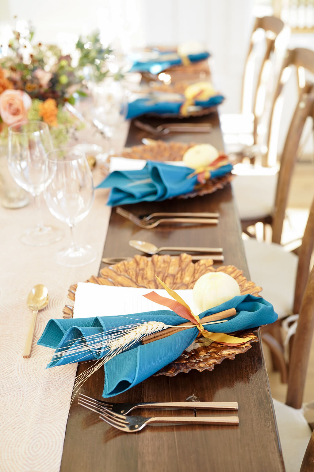
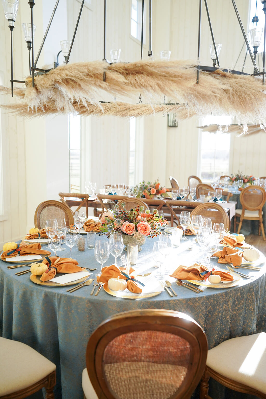
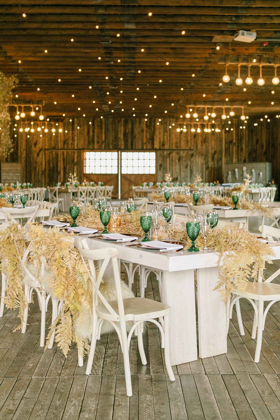
Isabel says “My favorite fall design was the River Bottoms Ranch Grand Opening we executed lat year. The various warm tones, including brown, rust, orange, and yellow, combined with a rich blue tone created a unique, warm, and cozy fall look. This vibrant and eye-catching tablescape allowed the warmer tones to overpower the cooler tone in the best way. Additionally, the variety of textures in the floral created a similar effect with the contrast between soft blooms and more coarse fillers, such as thistle. It was the perfect representation of the fall season and a striking focal point for each table.”
BillieJo says “I also love the River Bottoms Ranch Grand Opening! While the colors of this design are amazing, what really caught my eye with this event was all the texture found in the linens, chargers, and floral. The golden charger really gives the effect of a leaf crunching beneath your feet, while the velvet napkin visually warms up the design. I love that we covered the chandeliers in wheat and then added a sprig to each place setting, highlighting the rustic element of the venue. Looking at this design as a whole, it’s like I can smell, taste, and feel the crisp fall day this event took place on. This cozy design will easily be a favorite for years to come!”
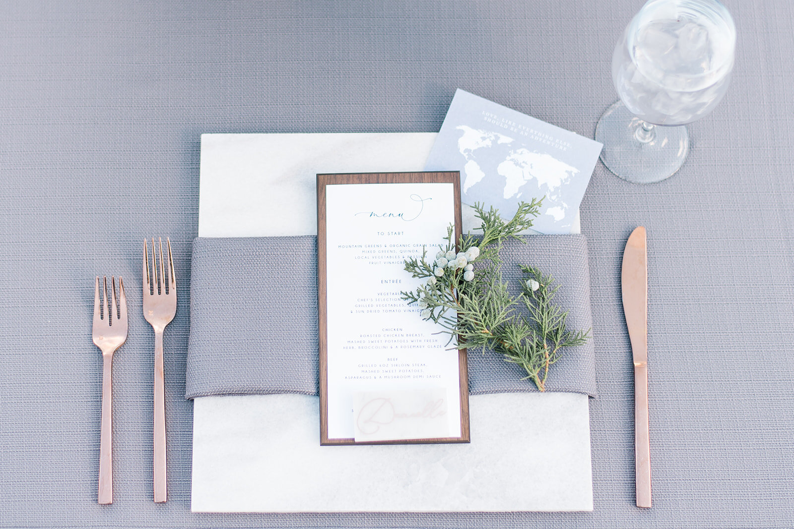
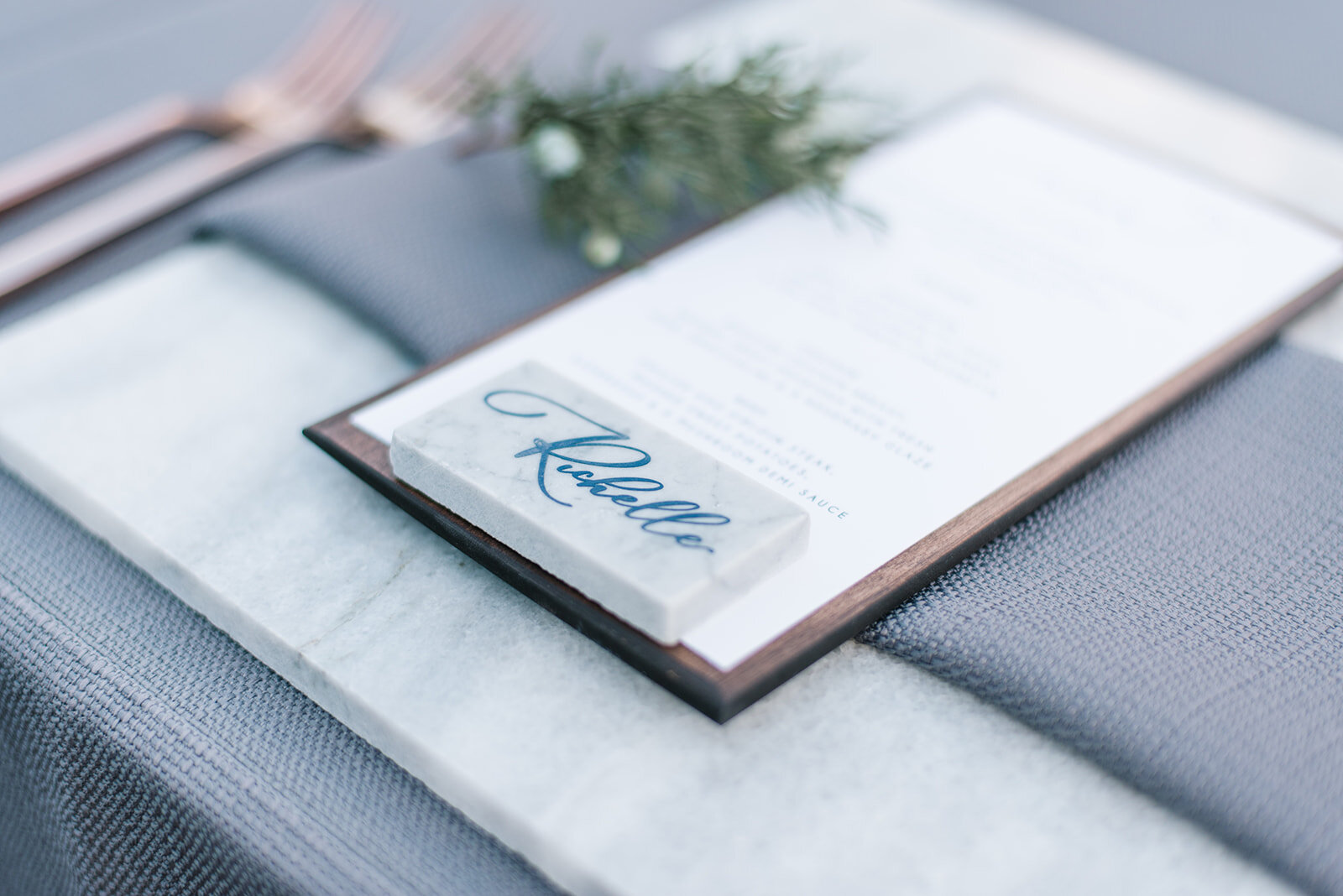
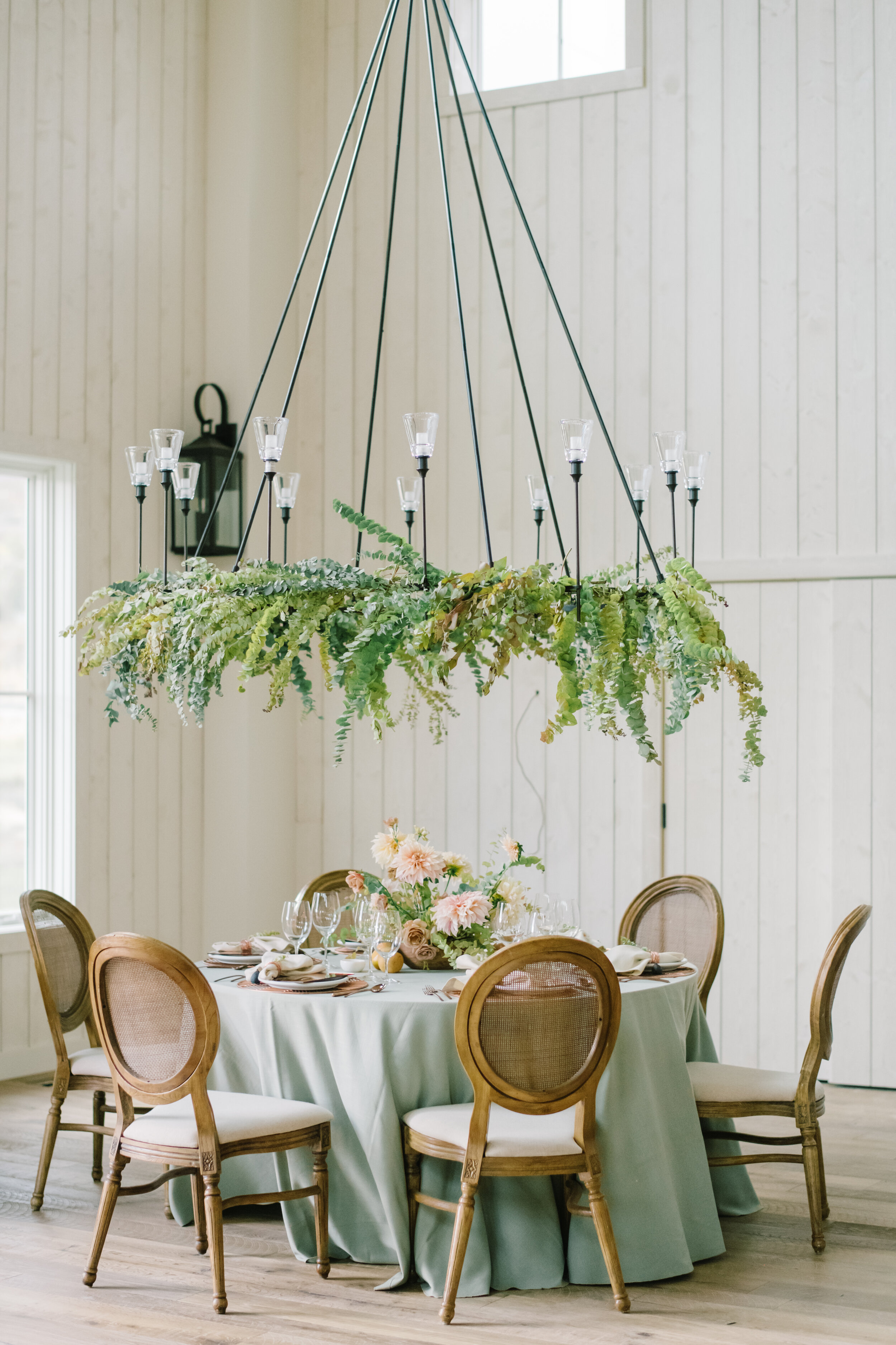
Nicole says “I love Liz and Will's Park City wedding. It pairs modern design elements with interesting natural embellishments. For example, the linens are cool toned whites and blues decorated with cement vessels holding blooms that appear to be growing right from the soil in front of you. The menu placed on MLE's unique handmade wood backer and topped with marble place cards also ties in the earthy elements that were added to this clean design. The biggest reason I love this wedding design is because it feels incredibly personal to the couple and shows what a skilled team of planners and vendors can do to elevate any client’s style!”
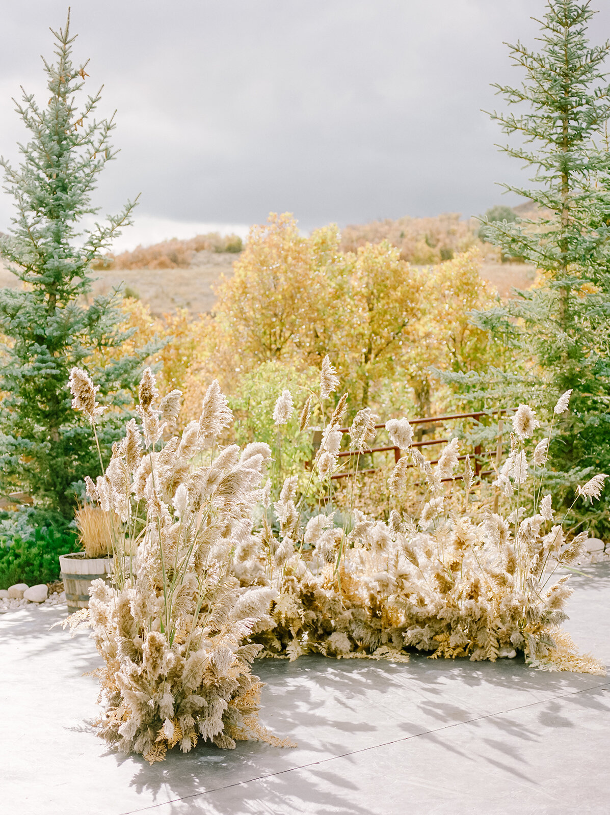
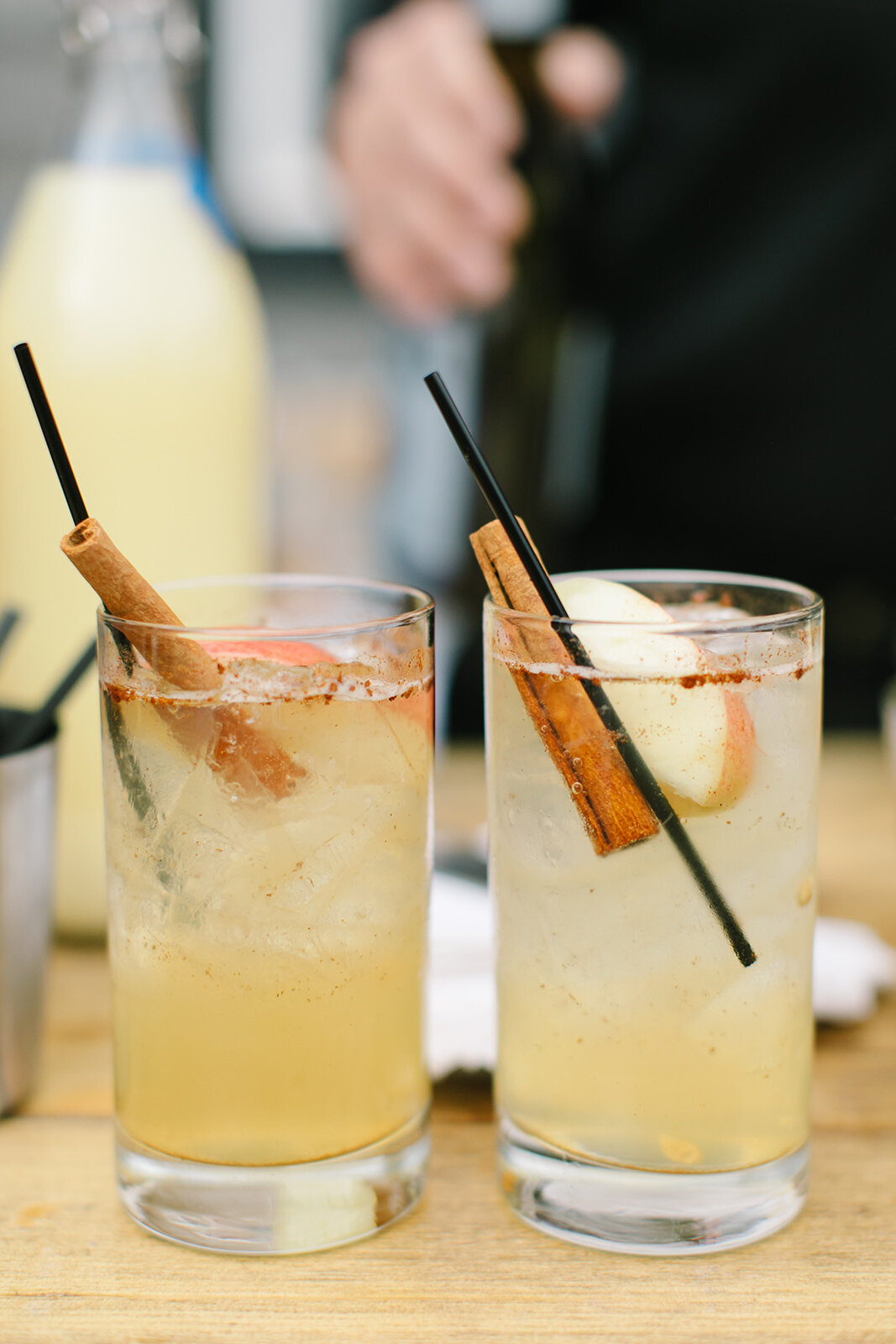
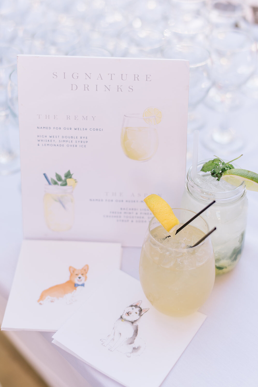
Mackenzie says “A favorite fall wedding of mine was Kate and Jack's at Blue Sky Ranch. Every detail of the event embodied fall, from the seasonal cocktails complete with cinnamon stick embellishments to the golden and amber tones used in the floral design. I loved how the foliage and fauna were actual plants and flowers you could find in nature in the mountains of Utah. To top it off, Kate's dress was definitely a favorite and fit the venue and the vibe of her wedding so well. I really appreciated how flawlessly the wedding design tied in rustic mountain elements.”
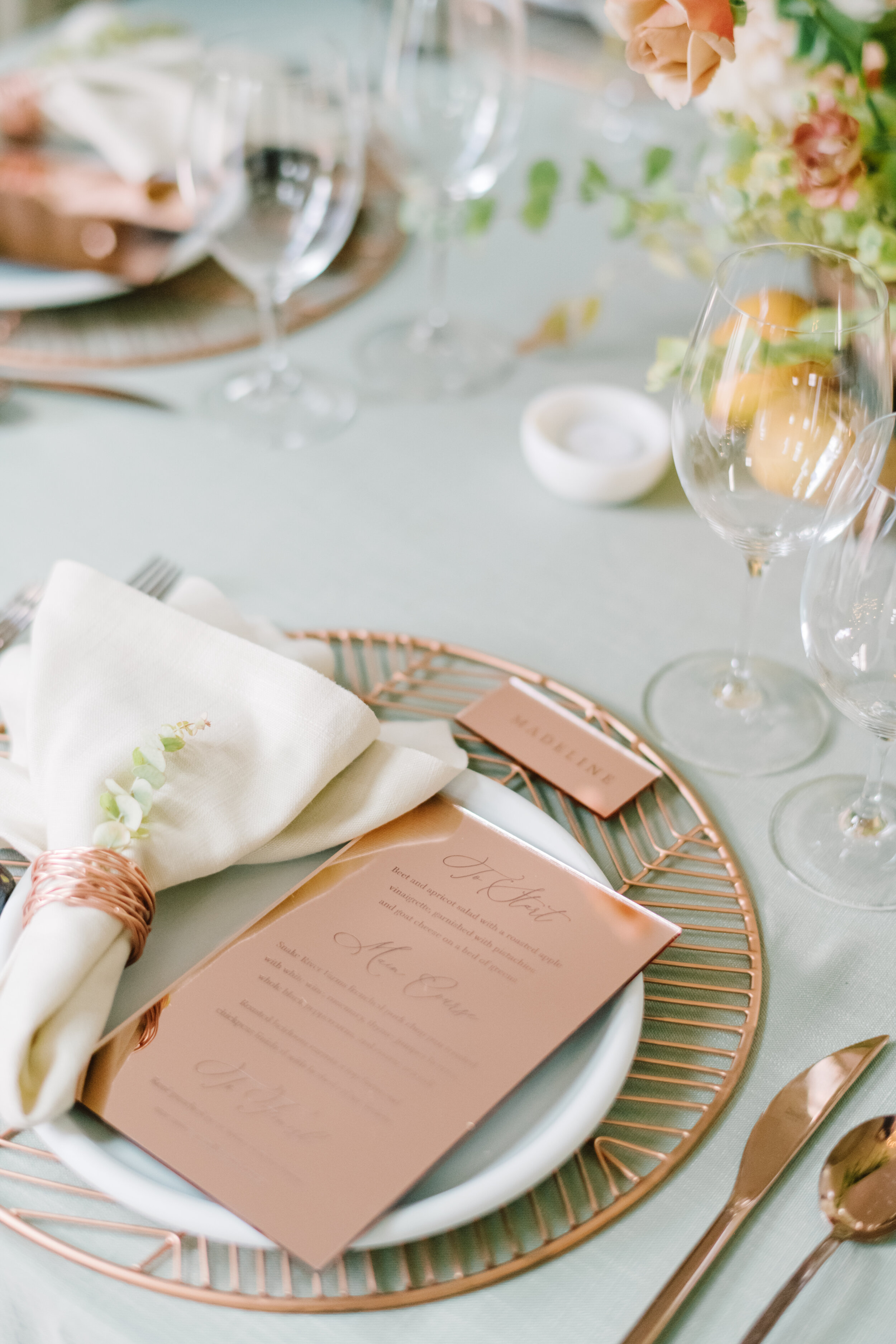
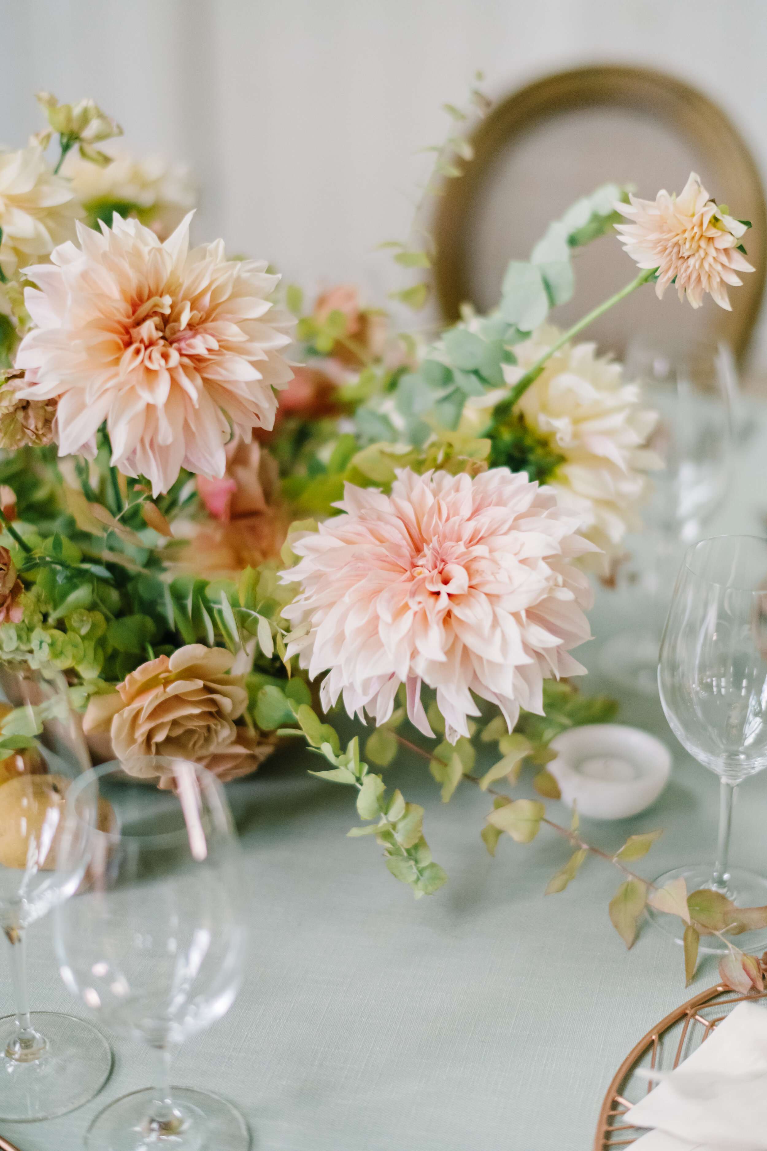
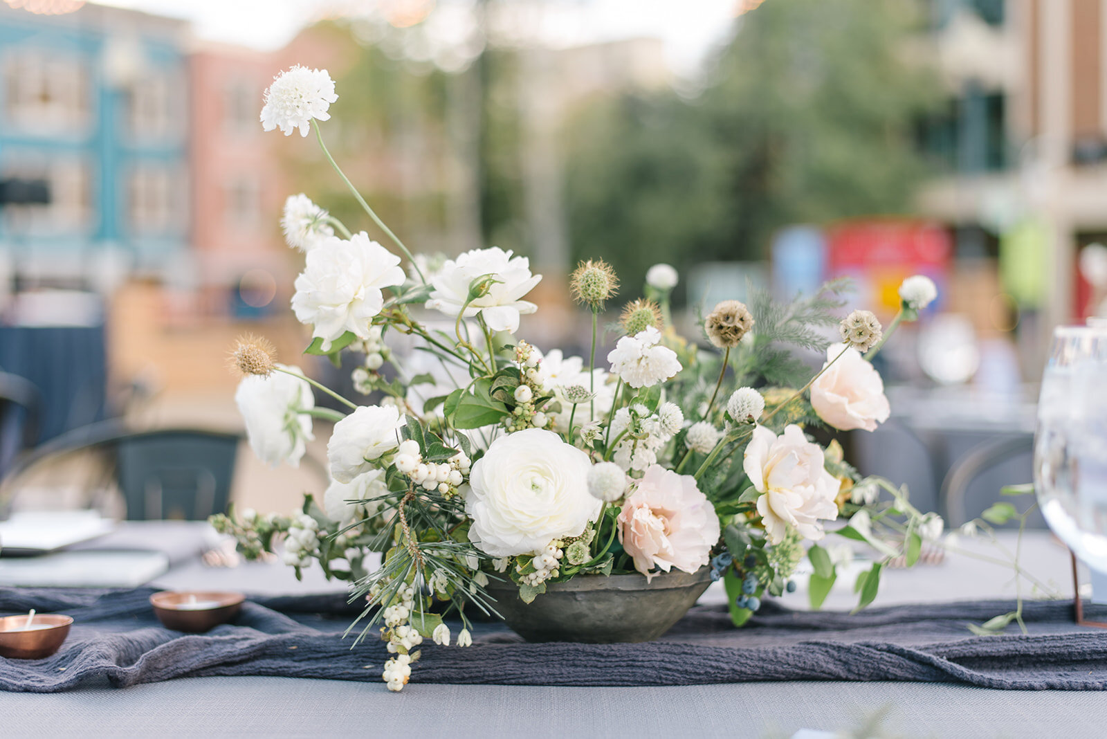
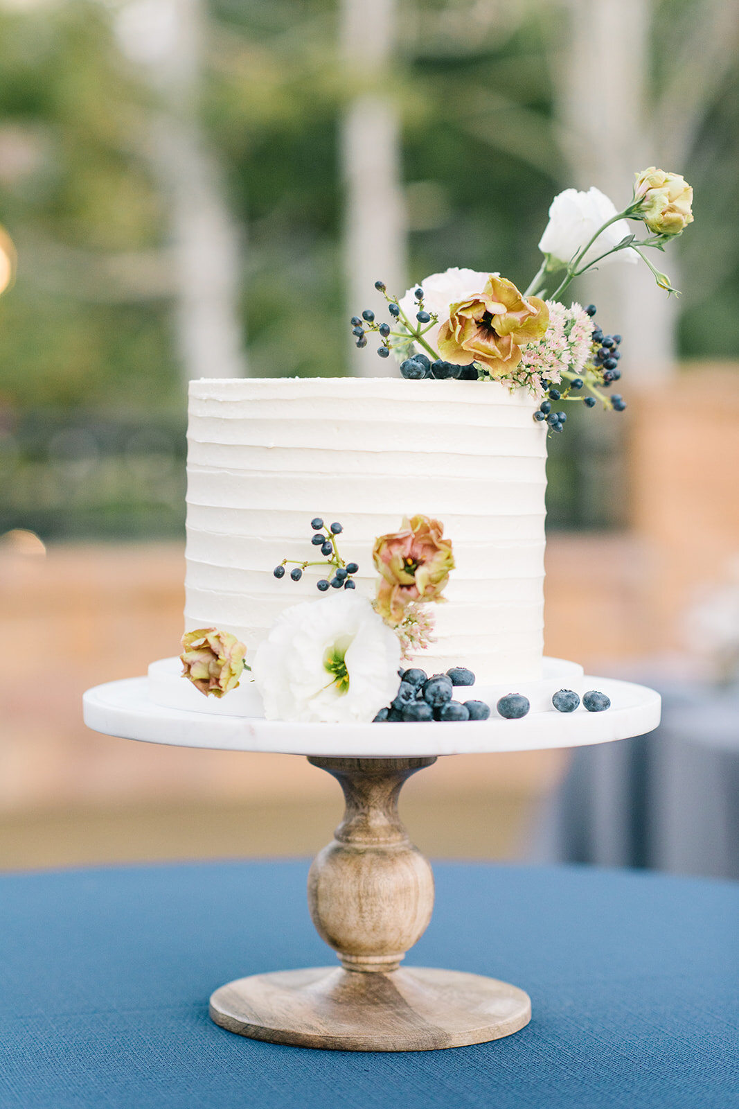
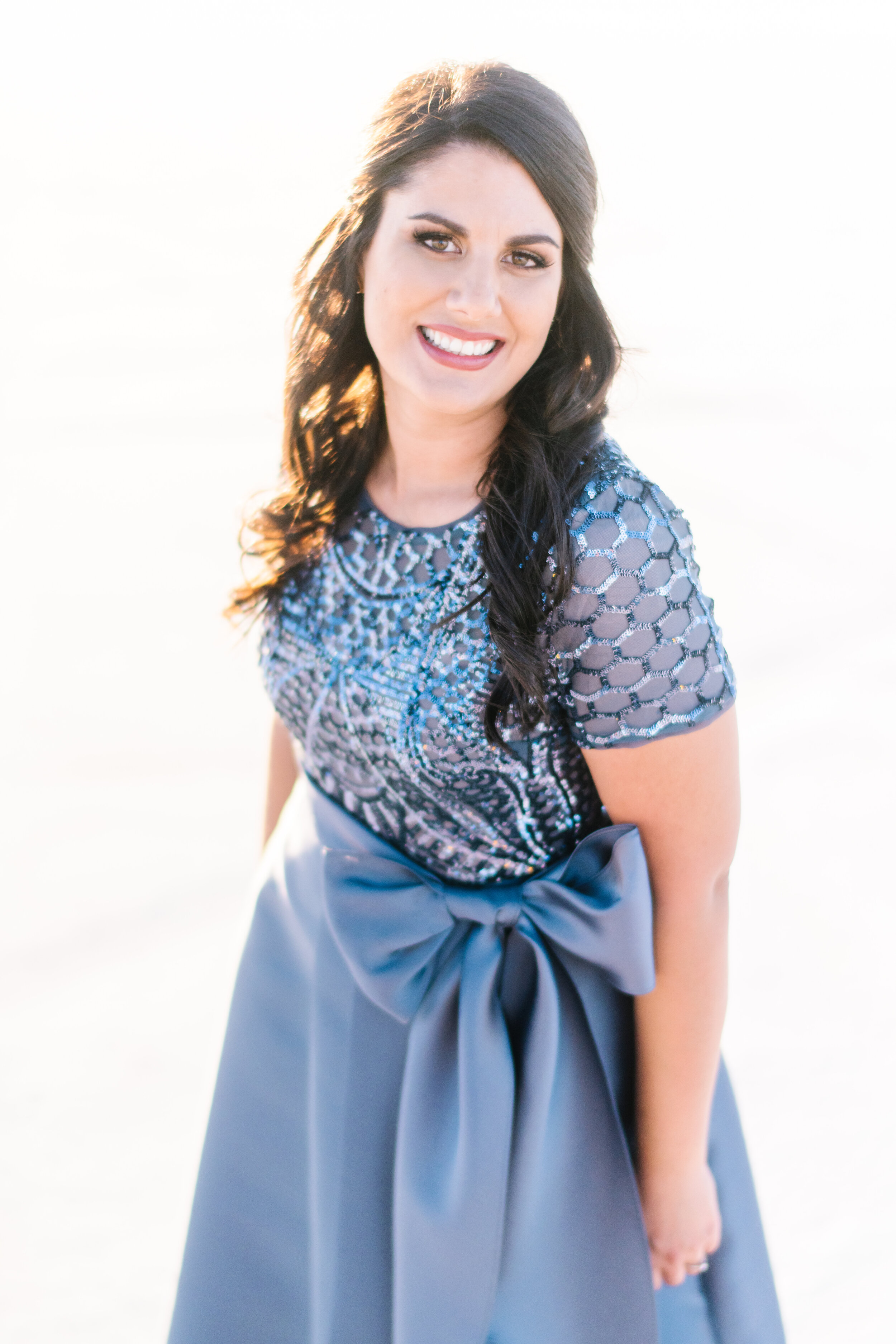
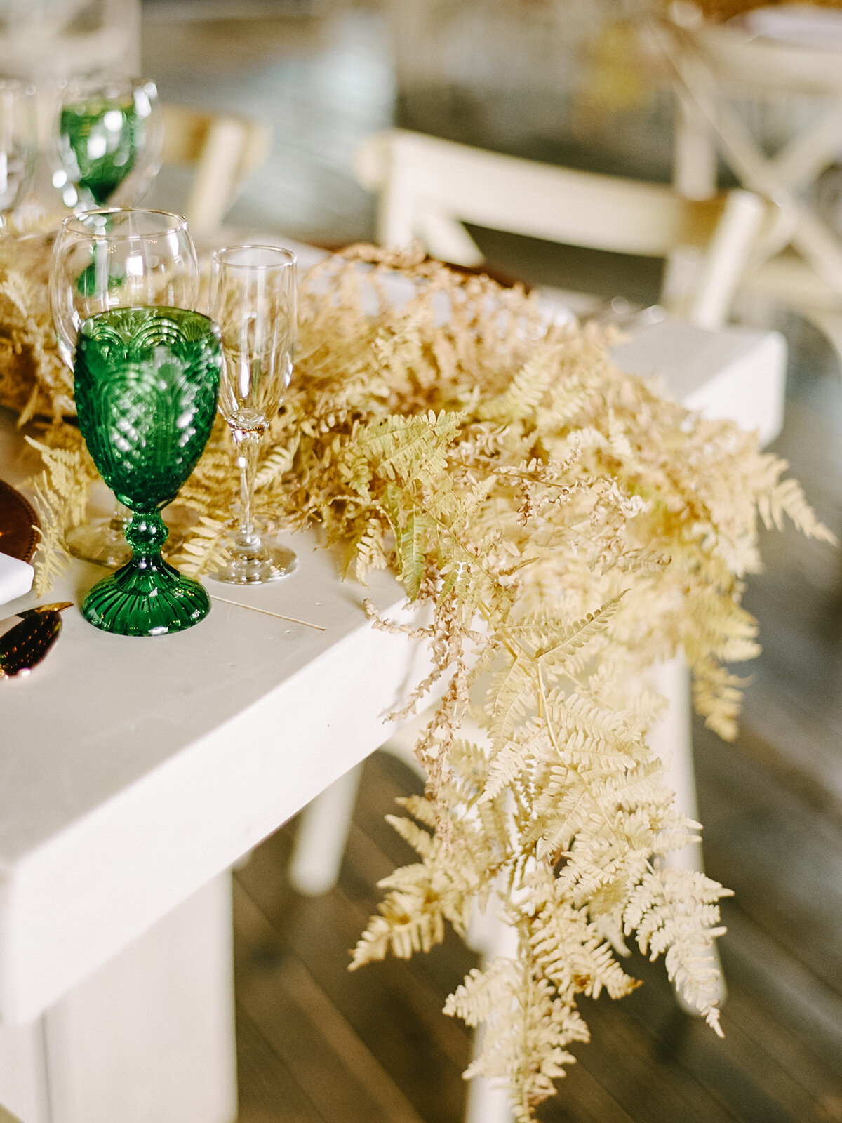
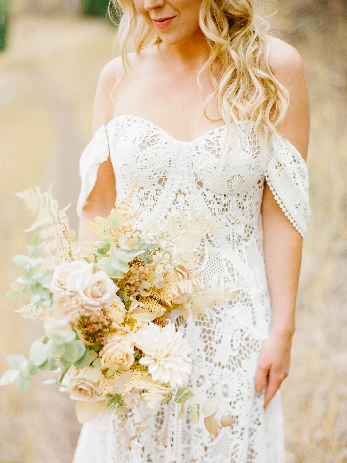
Emily says “My favorite fall design has to be the editorial created for Rocky Mountain Bride Magazine. I love how the color palette highlights the subtleties of the season with the softer sage green in the linen and greenery and the use of blush pink (my personal favorite), as well as warmer yellow and tan shades in the floral! The metallic accents, found in the patterned copper charger and rose gold acrylic menu and place card, added just the right amount of sparkle to the overall table design. The floral centerpiece, full of dahlias, roses, greenery and more, created interesting texture and just the right amount of boldness to draw the eye inward and upward. Say goodbye to the days of red, orange, and brown fall tablescapes because this soft and elegant breath of fresh air is here to stay!”
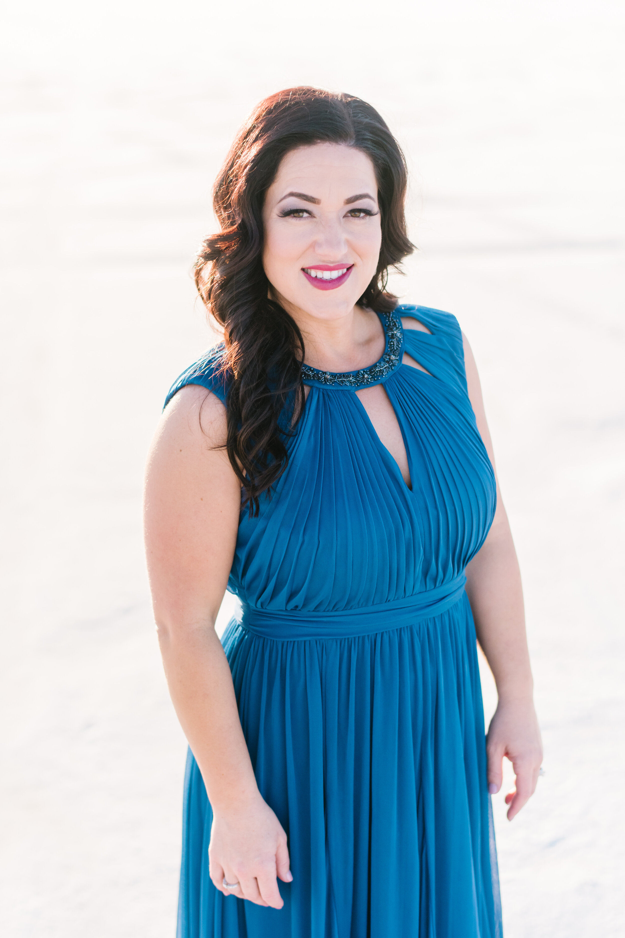
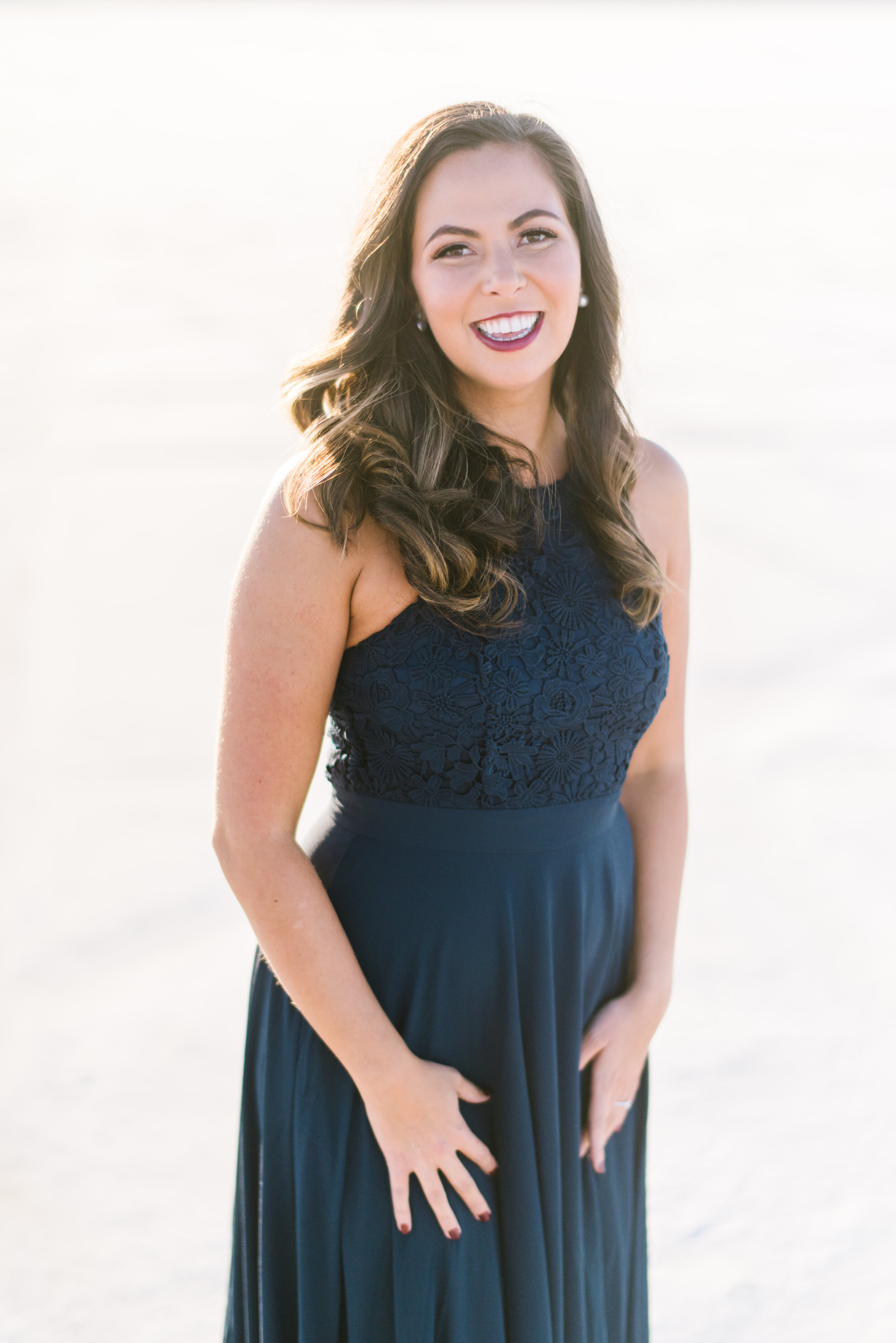
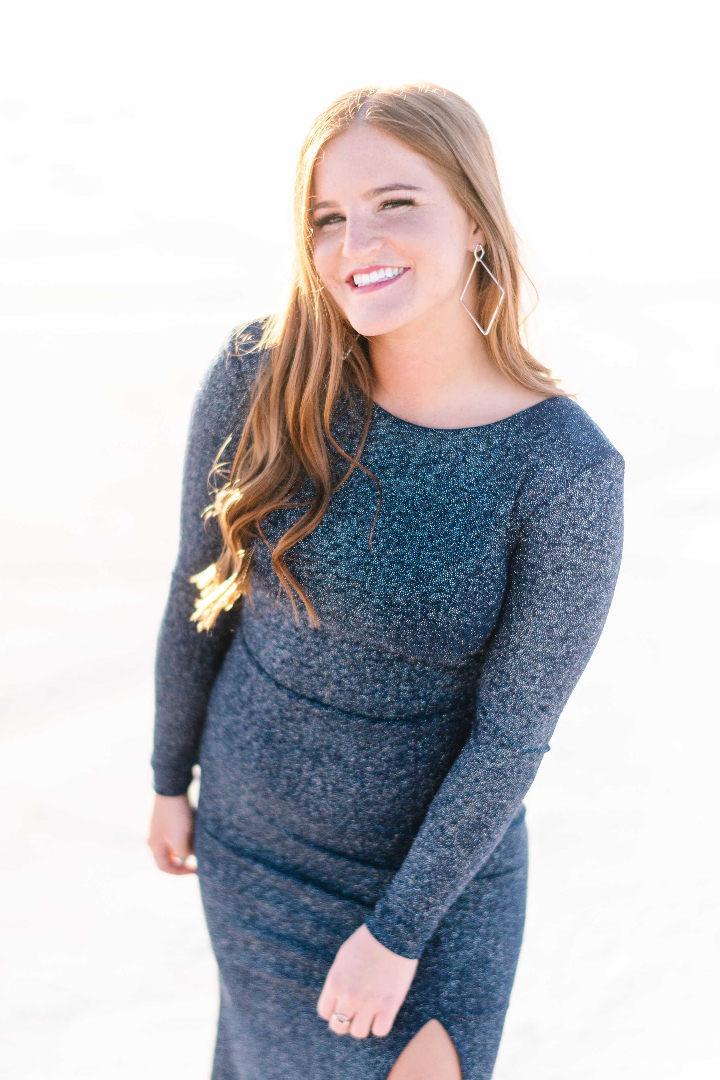
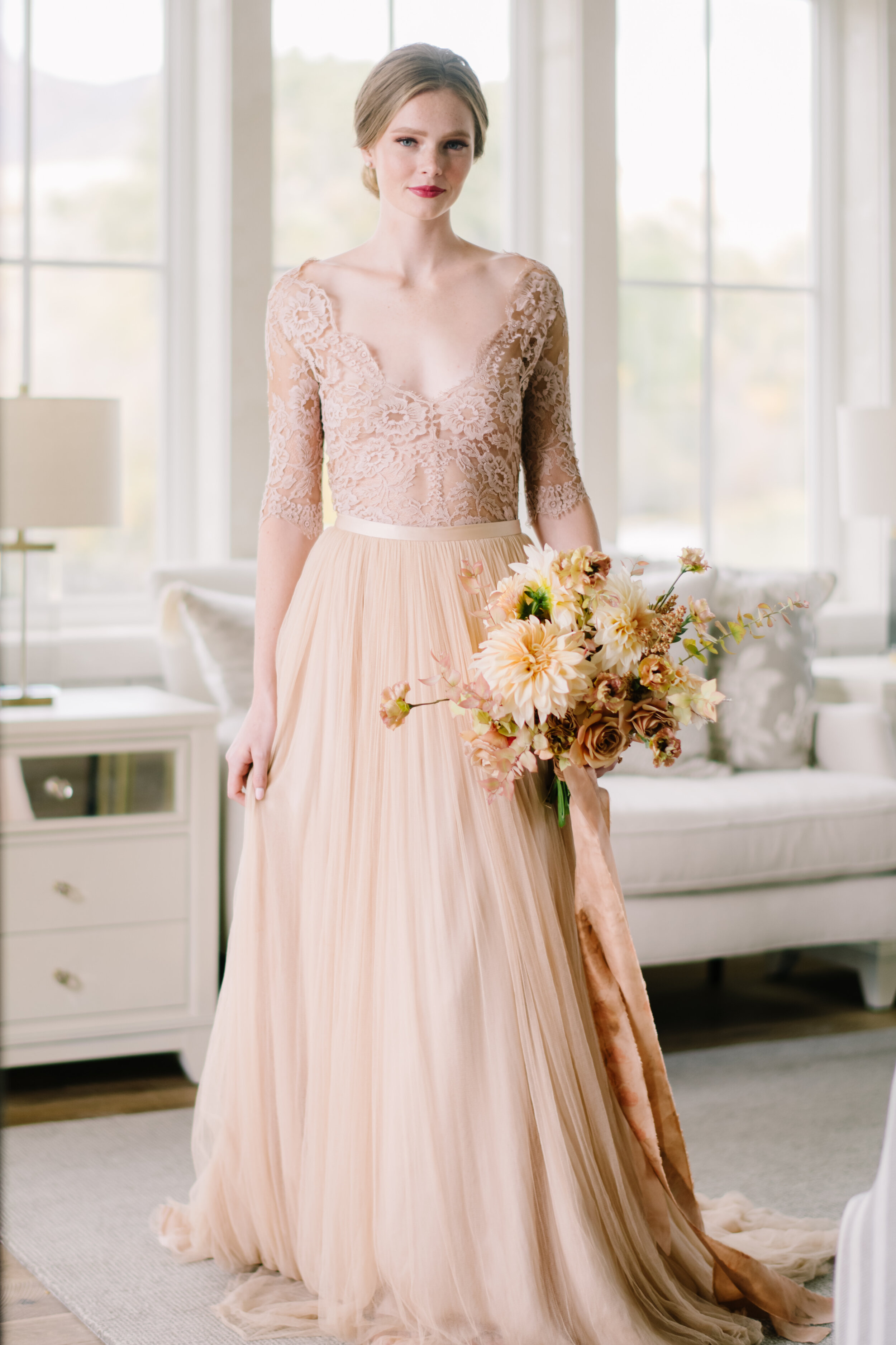
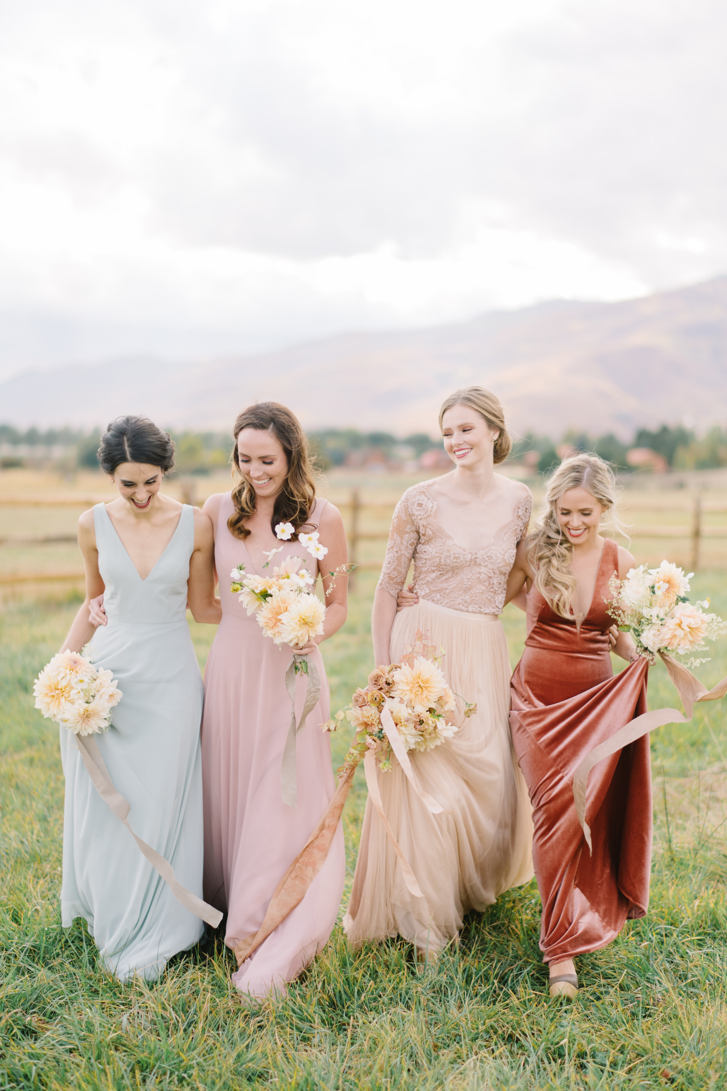
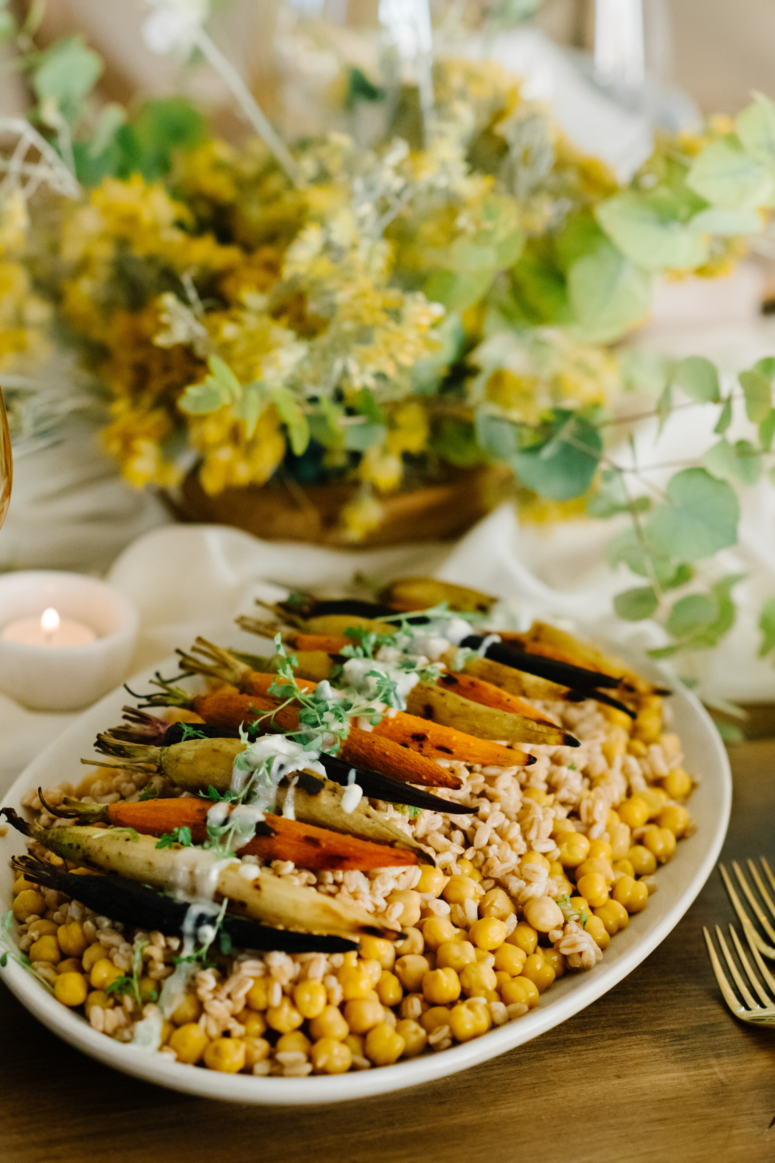
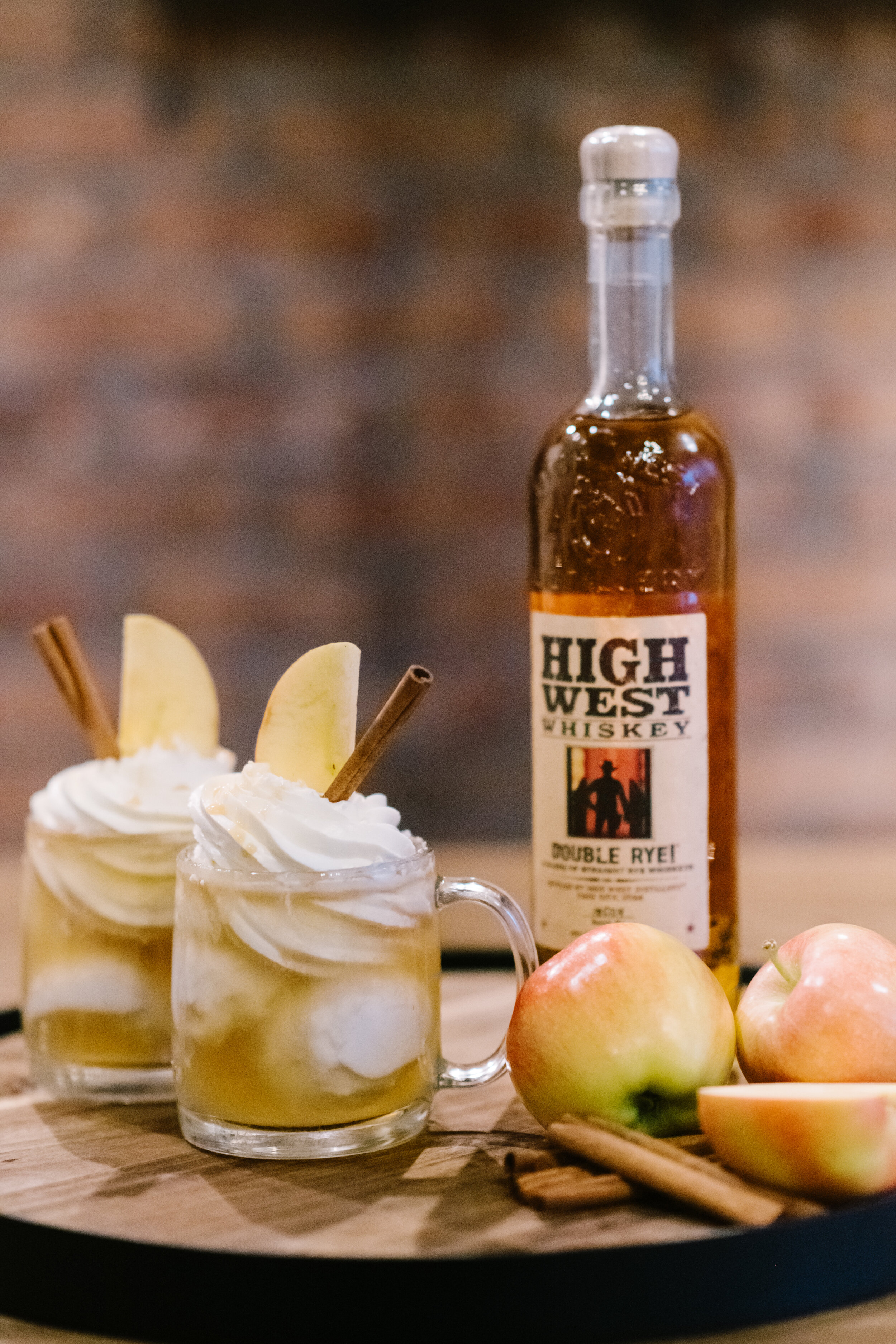
Edward says “I also loved this year’s Rocky Mountain Bride Magazine editorial. I love that the brides dress was a sand color, rather than a traditional white, which really made it stand out against the all white venue. It not only made a subtle statement, but also complimented the design as a whole. Although the bridesmaids also wore various colors, the bride remained the focus because of the gorgeous lace detail on the top of her dress. I can’t forget to mention the menu, it was perfect for fall! Roasted veggies and warm apple and cinnamon drinks just come with the season, don’t you think?!”